A tour of the workspace
When a tutorial says "the sidebar" or "the right panel", this is where to look. Here's a quick walk around the Gridfinity Layout Tool on a desktop screen. It starts with the layout editor, then visits the other two tools, phones and tablets.
The header
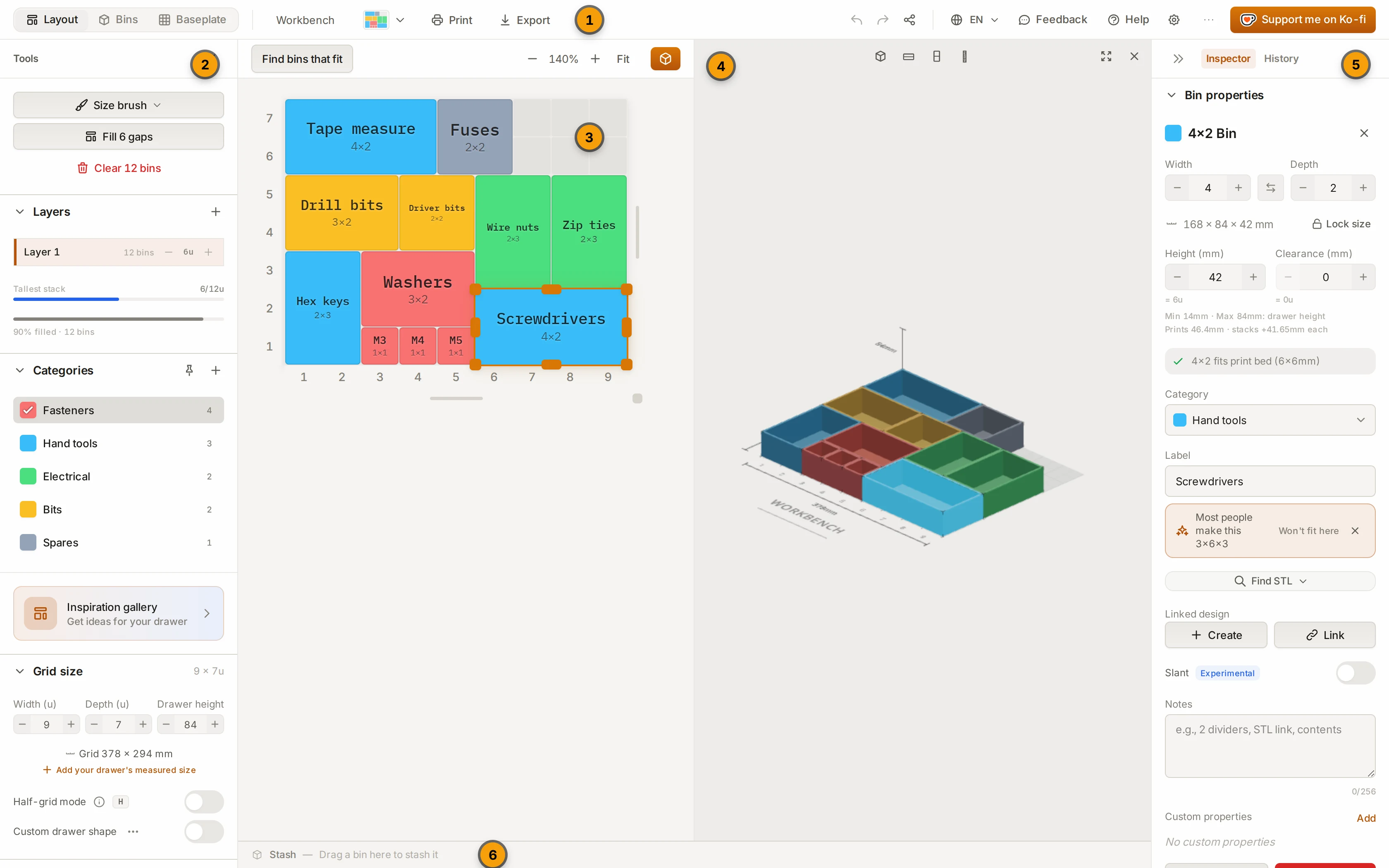
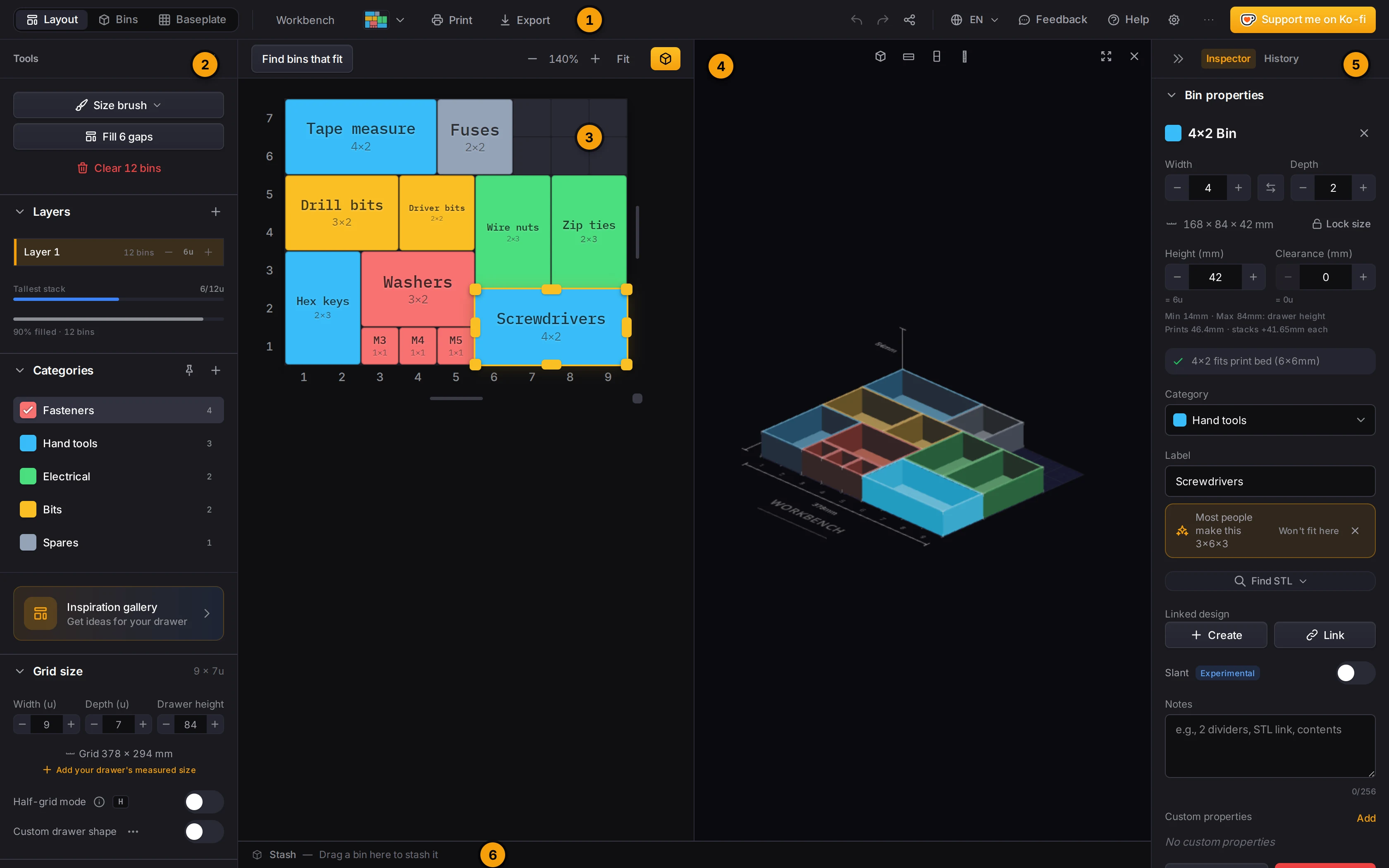
From left to right, the layout editor header has these controls:
| Control | What it does |
|---|---|
| Tool switcher | Opens the layout editor, the bin designer or the baseplate generator. |
| Layout name | Click the name to change it. |
| Layout menu | The button next to the name. It has New layout and Manage layouts. |
| Opens a paper plan of the drawer to print. | |
| Export | Downloads a ZIP of each linked bin and the baseplate. |
| Saved | Shows that the Layout Tool saved your last change. |
| Save failed | Shows that a save failed. The Layout Tool tries again by itself. |
| Undo and redo | Undo or redo your last change. |
| Share layout | Makes a share link for the layout. |
| Change language | Sets the language of the Layout Tool. |
| Feedback | Opens the issue tracker to report a problem. |
| Docs | Opens these docs in a new tab. On most screens it shows as a book icon. |
| Help | Opens help and the list of keyboard shortcuts. |
| Settings | Opens the settings window (the gear icon). |
| More links | Links to these docs, the source code and the Gridfinity community. |
| Support me on Ko-fi | Opens the page to support the project. |
On narrow screens, some buttons show only an icon. Hover over an icon to see its name.
The left sidebar
The left sidebar has the title Tools. From top to bottom, it holds:
- Layers and categories. The active layer, the list of Layers, and the list of Categories.
- Inspiration gallery. Ideas for your drawer.
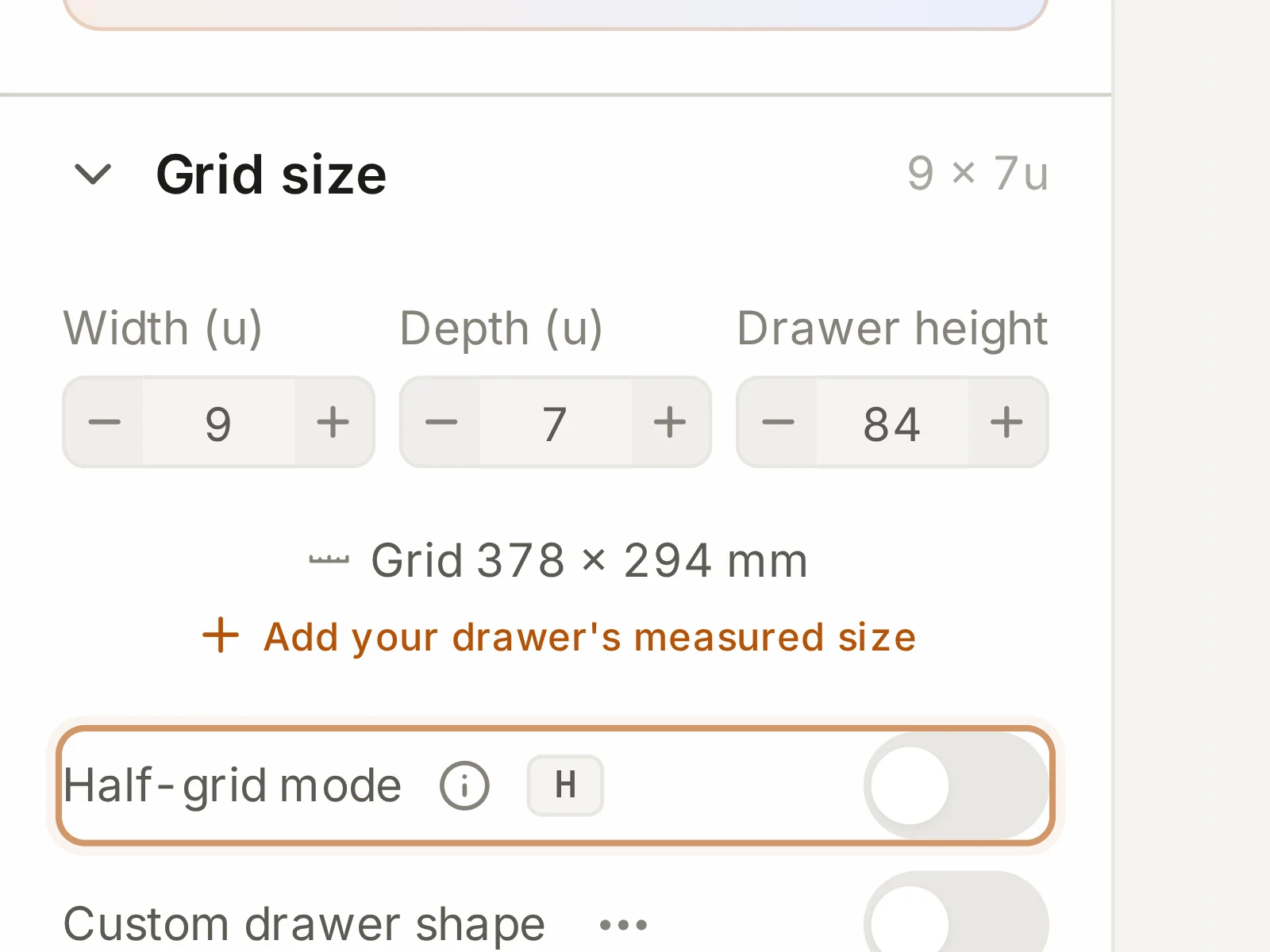
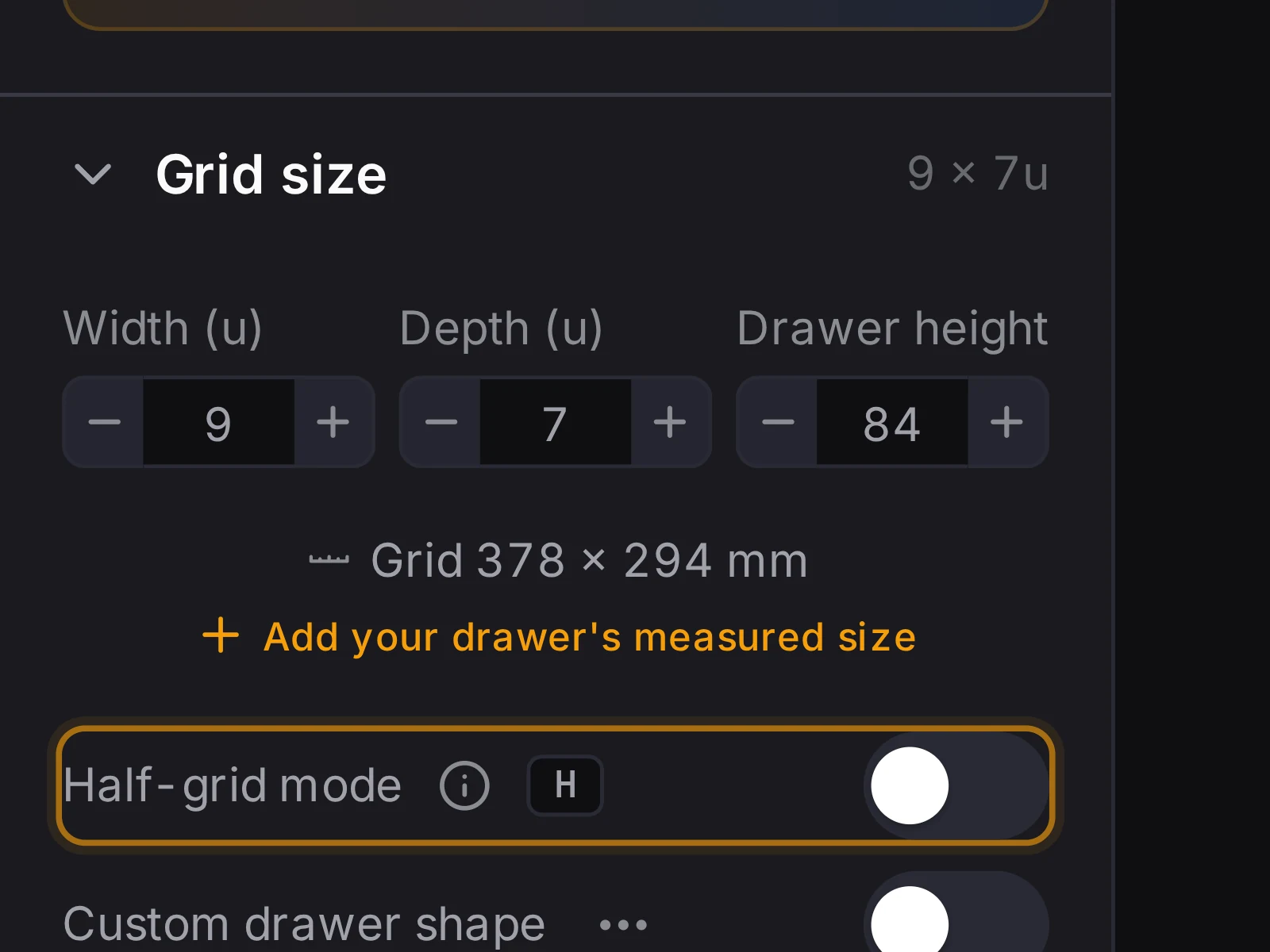
- Grid size. The drawer size in grid units, the measured size in millimeters, and Half-grid mode.
- Physical units. The grid unit, the height unit and the print bed size.
- Baseplate. The baseplate for this layout.
- Learn. Links to the guides on the website.
- Account. At the bottom, Working locally tells you that you work without an account. Click it to sign in.
Need more room for the grid? Click Collapse left panel (the double arrow at the top of the sidebar) to hide it.
The grid and the stash
The grid in the middle is your drawer. Drag across empty cells to draw a bin.
The toolbar above the grid has the zoom buttons and Fit. It also has Find bins that fit and 3D View. With more than one layer, you also get Show layers below.
Below the grid is the Stash, a holding area beside the drawer. Drag a bin there to keep it off the grid without deleting it. When you make the drawer smaller, bins that no longer fit go to the stash, so you don't lose them.
The 3D preview
Click 3D View or press V to open the 3D preview. On a desktop screen, it takes the right half of the grid area and shows each bin at its real height.
The right panel
The right panel has two tabs.
- Inspector shows the properties of the selected bin. Select more than one bin, and it shows Multi-selection. Below the properties is the Bin list, which is your print list.
- History lists snapshots of the layout. The Layout Tool saves a snapshot every 2 minutes. You can restore a snapshot, or open it as a new layout. It's a safety net if you change your mind about a big edit.
To hide the right panel, click Collapse right panel.
The command palette
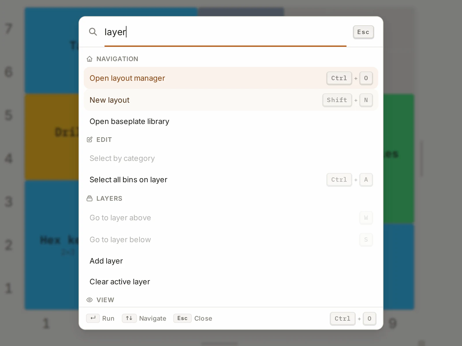
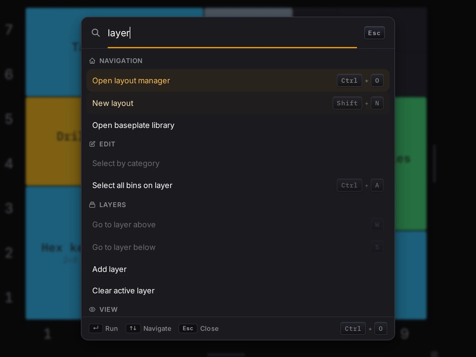
Prefer the keyboard? The command palette finds and runs any command in the layout editor. Press Ctrl+K (Cmd+K on a Mac), then type a part of the command name. The palette works in the layout editor on desktop and tablet screens. Keyboard and command palette explains what it finds.
Help and search
Click Help in the header, or press ? or /. The help window has two tabs: Shortcuts and Tips & info. Read the docs, at the right of the search field, opens these docs in a new tab.
Can't find a control? Type in the search field at the top of the window. The search finds shortcuts and features for the tool that you have open. A result for a control has a Go to button, which takes you straight to it. In the layout editor, if no result matches, click Search all commands instead.
The bin designer and the baseplate generator
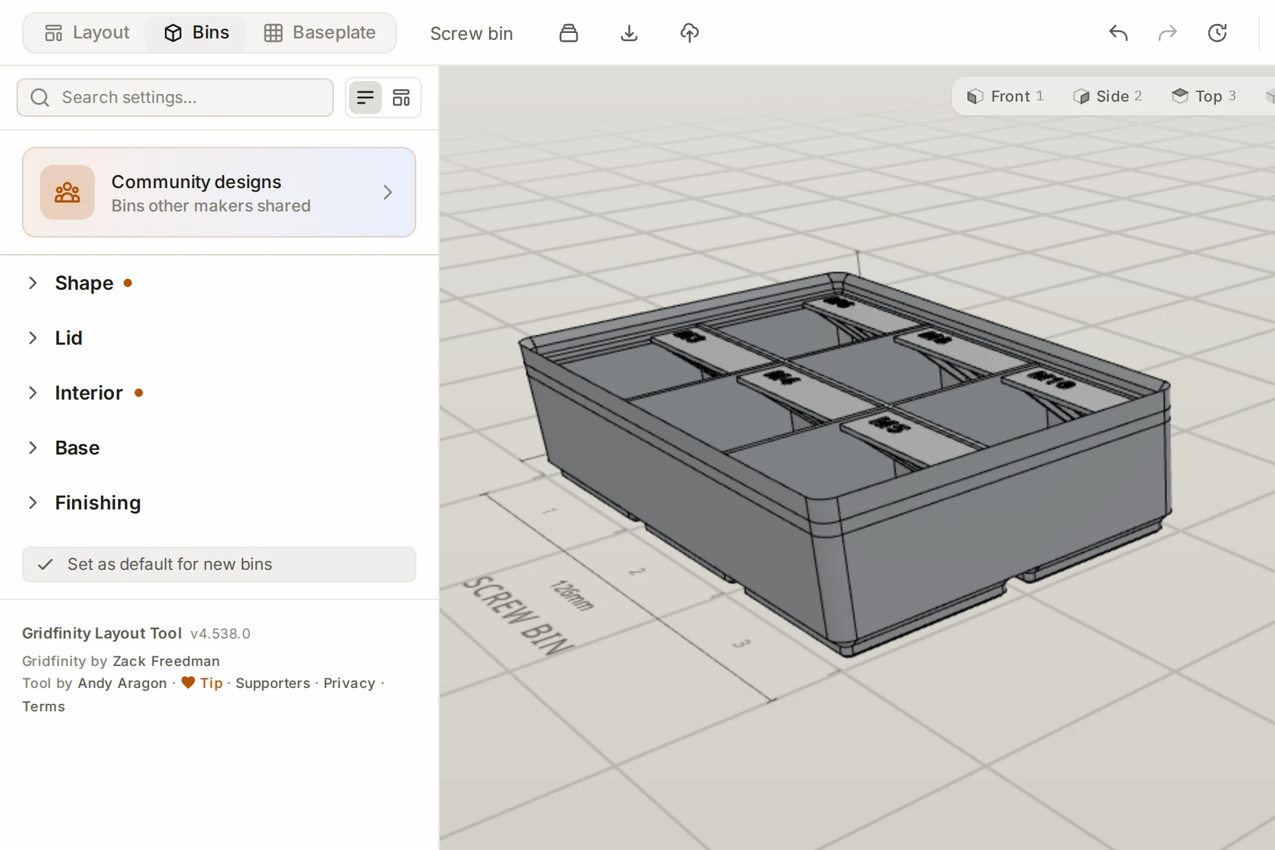
The other two tools follow the same plan: a header, a settings panel on the left, and a 3D preview on the right.
The bin designer header starts with the tool switcher and the design name. Then come these controls:
| Control | What it does |
|---|---|
| Designs | Opens your library of saved designs. |
| Export | Downloads a print file of the bin. |
| Publish | Publishes the design to the community gallery. |
| Undo and redo | Undo or redo your last change. |
| Version history | Shows the saved versions of the design. |
The bin designer panel puts its settings in five groups. Click a group to open it or close it.
| Group | What you set there |
|---|---|
| Shape | Size, footprint, slant, walls, wall cutouts, and the fit on the print bed |
| Lid | Lid, pull tab and handles |
| Interior | Compartments, dividers, label tabs, finger scoop and more |
| Base | Feet, stacking lip, magnets and screws |
| Finishing | Text, colors, wall and floor patterns, and physical units |
This is the Single scroll view, the default, and every bin designer page in these docs uses it. A switch next to the search field at the top of the panel also offers Compact sections, a more compact view of the same settings.
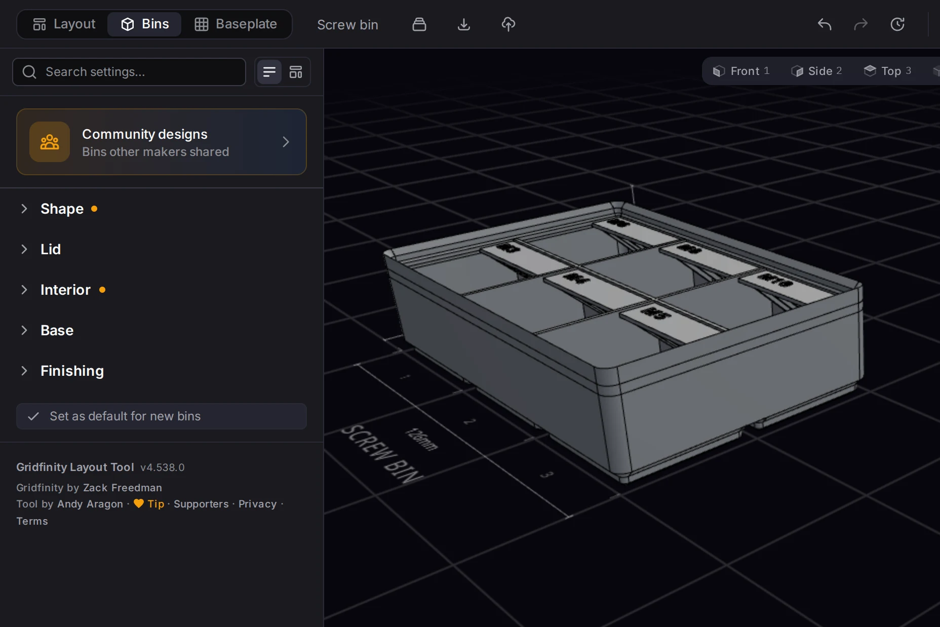
The baseplate generator header has the tool switcher, the baseplate name, and Export. Its panel starts with the Dimensions and Base groups. Below them come Physical units and, for a split plate, the map of pieces.
Phones and tablets
The Layout Tool changes its layout to suit smaller screens.
| Screen width | Layout |
|---|---|
| 900 px and wider | The desktop layout on this page. |
| 768 to 899 px | Tablet layout. The tool switcher shows icons only. The sidebar and the right panel slide in from the sides. Open them with the round buttons on the screen. |
| Below 768 px | Phone layout, with a bar of four tabs at the bottom. Each tab opens a panel from the bottom. |
The four phone tabs are:
- Layers: the layers of the layout
- Bin: the properties of the selected bin
- Categories: the categories and their colors
- List: the bin list
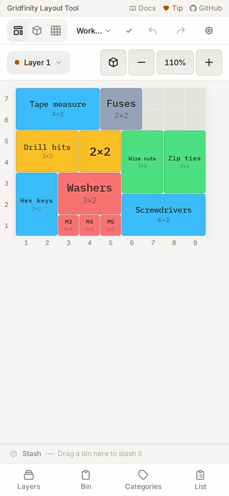
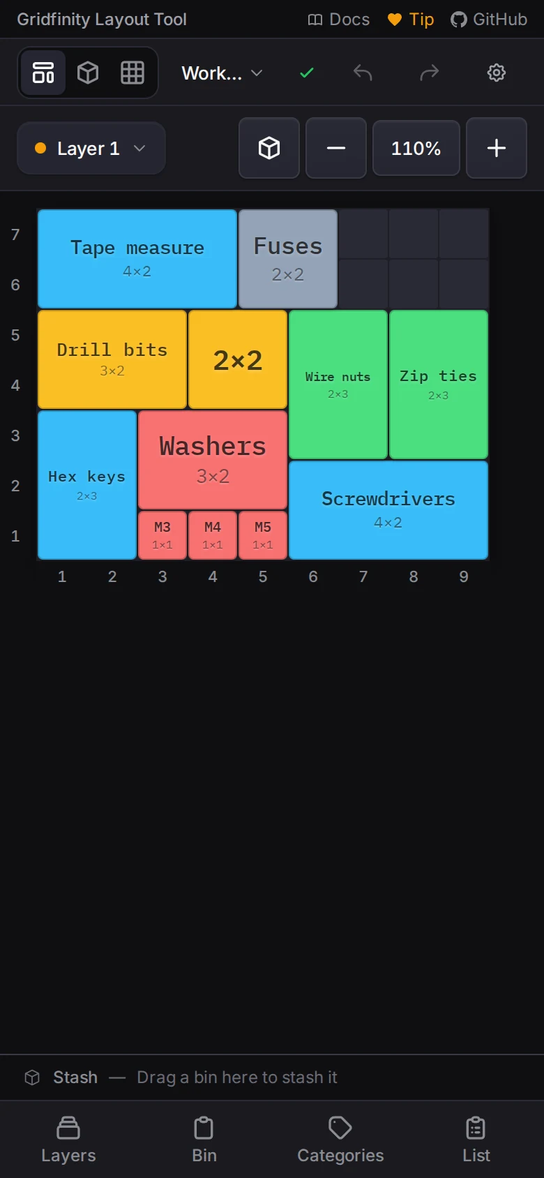
On a phone, the grid has no edge handles. To set the drawer size, tap Settings in the header. The command palette and the cutout editor need a larger screen.
Next steps
- Plan your first drawer: use the sidebar, the grid and the right panel in a real task
- Keyboard and command palette: all the ways to work from the keyboard
- Keyboard shortcuts: the full list of shortcuts